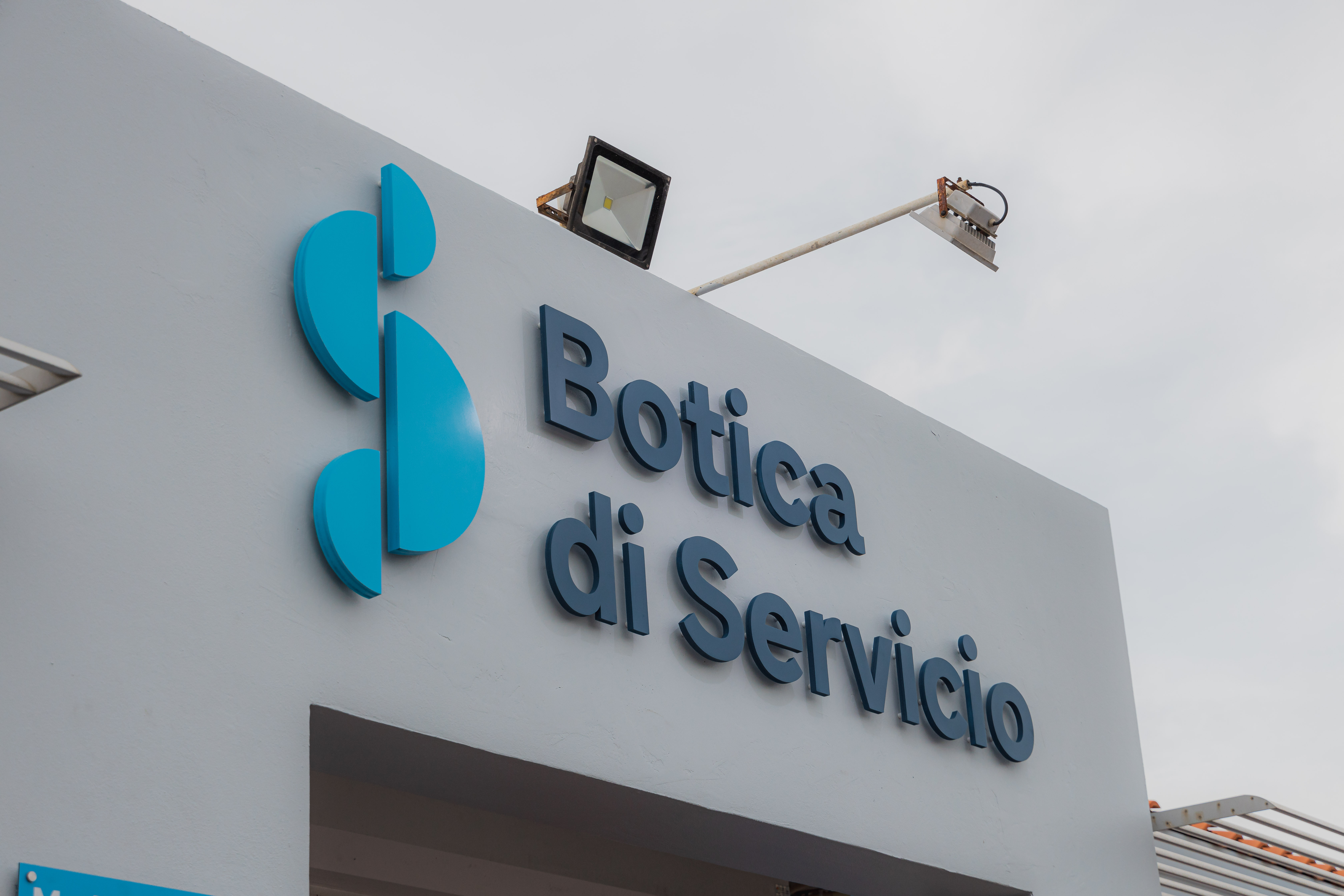
Recently, during the ceremony where Botica di Servicio was awarded their HKZ certification, the team also took the moment to introduce their new corporate identity. Botica di Servicio went through a complete transformation of its logo and colors.
Their new corporate identity has been completely revamped and consists of a logo resembling the letter S which stands for service, and is mainly in the color light blue. Their pharmacies in Eagle and Noord have already received a makeover and transformed into this new image. The rest will follow soon.
While their service and quality remain the same top-notch, it’s a really beautiful transformation and shows how Botica di Servicio never stands still and is always improving, even in their brand image.
GOOOAAALLL!
Congrats! You have scored and won:
If you have another code, play again!


 WhatsApp